Olympic & Titanic: Triumph and Disaster – Judging a Book by its Cover

There is a cliche that you should not judge a book by its cover, but many people probably do exactly that!
Getting a book’s cover design correct is very important. This includes not just the front, but the rear cover as well. Imagery catches the eye. The cover also needs to convey the content of the book. The process is a collaborative effort between the author and the design team at the publisher.
The title of the book, Olympic & Titanic: Triumph and Disaster, is intended to draw the contrast between the first two of the three ‘Olympic‘ class ships. A theme throughout is how similar these ships were from a design perspective and how their stories diverged so significantly. It seemed appropriate that Olympic should be on the front cover, as the more successful of the two. We see her depicted in a wonderful, sharp photograph as she sets out for New York. Everything portends a long, successful career which is exactly what lay ahead of her.
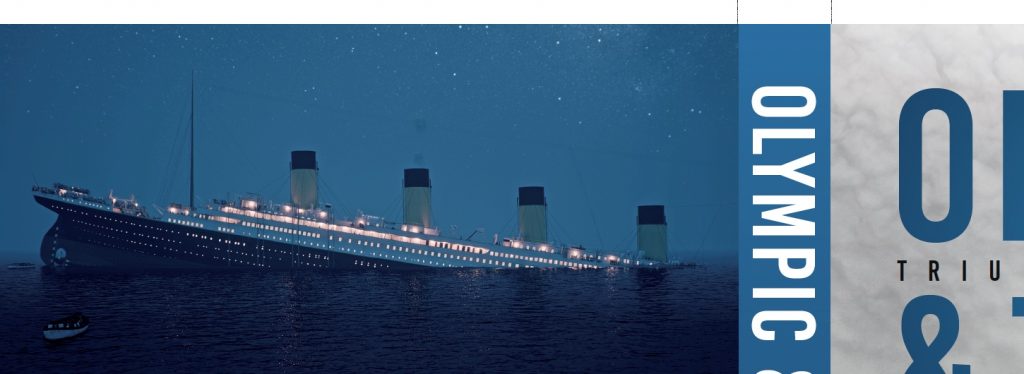
To complete the comparison, Titanic found her place on the rear cover. She represents the opposite of her successful sister – the ‘disaster’ in the final word of the book’s title. There are illustrations from 1912 depicting the sinking but I thought that a colour image would be a better representation and form a contrast with the black and grey colouring of the front cover. It was a pleasure to work with Tom Lynskey and Levi Rourke from HFX Studios, who kindly permitted us to use an illustration from their most recent Titanic sinking animation. As an added bonus, they had worked with the publisher before in providing imagery for other book covers, so were well acquainted with the process.
I think the cover designer, Martin Latham, and the History Press team did an excellent job. I feel the whole combination works well, with the blue lettering on the front cover, blue spine and dust jackets, and then the darker, blue sea extended down the rear cover to provide space for reviewer’s quotes.


To learn more about HFX Studios’ work or watch their stunning YouTube documentaries, click on the logos below!