Olympic & Titanic: Triumph and Disaster – Adding Some Colour!
History did not happen in black and white, even though we may sometimes visualise it that way through watching old movies or looking at pre-colour photographs.
I’m therefore very pleased that the book’s 416 black and white pages are supplemented by a 12 page colour section which includes stylish period advertising produced for the White Star Line; the ‘Design “D”‘ concept signed off in July 1908; key documents (including entries from one of Harland & Wolff’s series of five engineering notebooks related to Olympic and Titanic); blueprints and original plans; and modern recreations of both ships’ interiors.
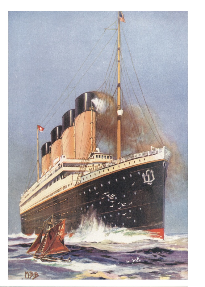
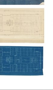
Above: One of the colour section’s pages includes a stunning illustration of Olympic (left); another shows a comparison of Harland & Wolff plans and blueprints, produced as they formulated a scheme to expand Titanic‘s first class accommodation on B-deck (right).
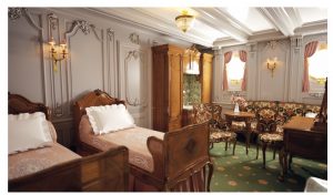
The interior recreations include eleven interior images kindly supplied by Matt DeWinkeleer and the team at Titanic Honor & Glory, covering first, second and third class interior spaces modelled using the most up to date research (grand staircase image, below). Three further interior recreations were kindly supplied by Giovanni Castro, including first class interior spaces showcasing comparisons between Olympic and Titanic (first class stateroom image, below).
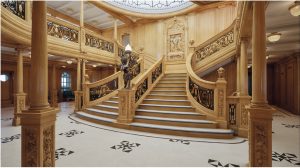
Many details seen in these images tie in to information included elsewhere in the book, such as the curved line at the base of the grand staircase’s bottom step on A-deck. The book includes an account from the Holland America Line’s Willem Piek Jr., who commented on this feature and thought it might make passengers more careful when descending the stairs.
To learn more about Titanic: Honor & Glory’s work and see the stunning interior recreations, click on the logos below!
To see Giovanni Castro’s work and and his incredible interior images, checkout his Instagram and Patreon: